Table of contents
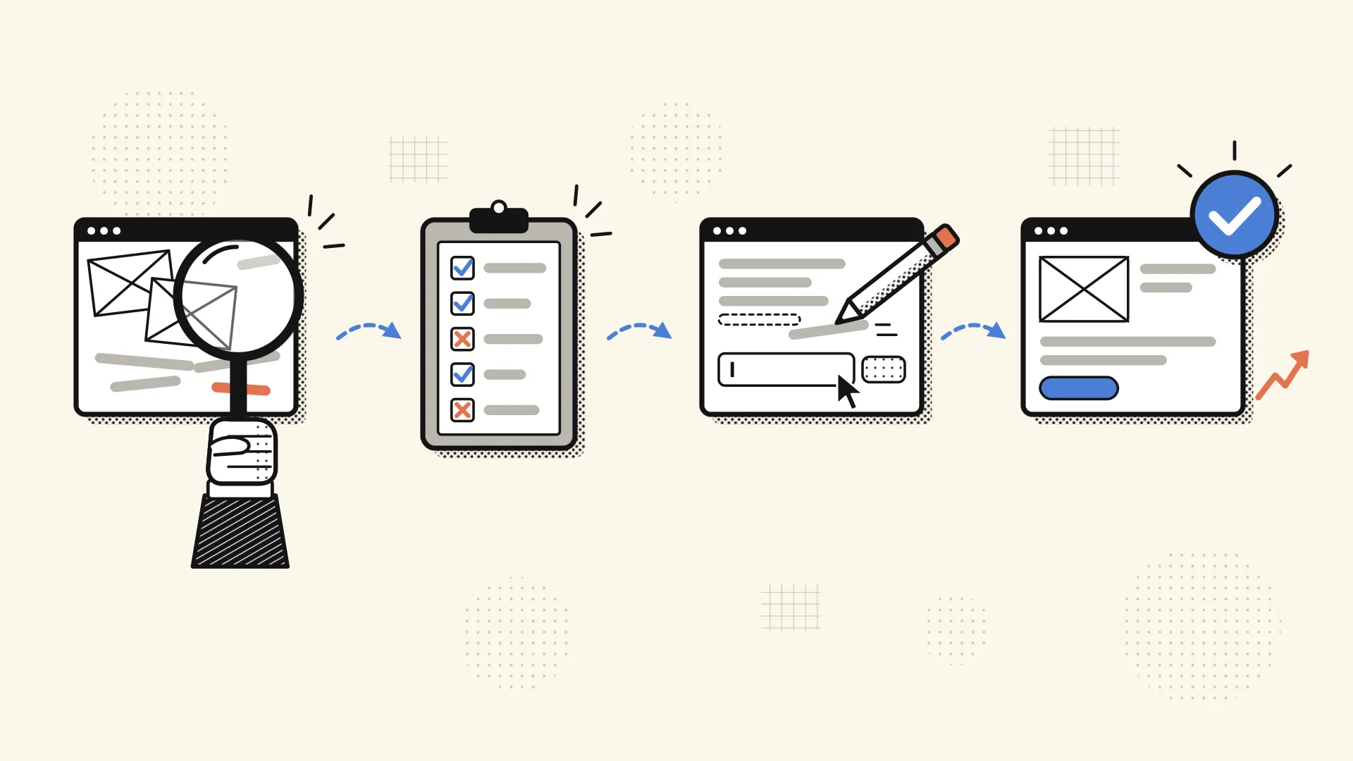
A website UX audit checks whether visitors can quickly understand what you offer, find what they need and contact you on any device. You can run a basic one yourself in an afternoon with free tools, using the website UX audit checklist below: 25 pass/fail checks across first impression, navigation, content, mobile, forms, speed, accessibility and trust. Fix anything that blocks a lead first. Then decide whether your site needs small fixes, a page refresh or a full redesign.
Key takeaways
- Start with what stops enquiries: broken forms, unclear calls to action, poor mobile layouts and slow pages.
- Measure against published thresholds from Google and the W3C, not rules of thumb copied between blogs.
- Basic accessibility failures are very common, and many are quick to fix.
- Treat anything you can’t verify as a fix until you’ve checked it.
- A self-audit catches the obvious problems. Watching a few real people use your site catches the rest.
- Many fails across many groups usually mean a redesign beats patching.
What is a website UX audit?
A website UX audit is a structured review of how easy your site is to use and act on. It answers one practical question: can the right visitor understand you, trust you and get in touch without friction?
It is not the same as an SEO audit. An SEO audit asks whether search engines can find and rank your pages. A UX audit asks whether people can use those pages once they land. The two overlap on speed and mobile, but a site can rank well and still lose visitors at the contact form.
This post is a hands-on audit you run once. For the ongoing process of improving a site over time, see our UX optimization guide.
When should you audit your website?
Audit before you commit to a redesign, and any time leads drop without a clear reason. A redesign without an audit can easily carry the old site’s problems into a new look.
Other good moments to run one:
- After adding new services, pages or offers
- After a rebrand or a shift in who you sell to
- When prospects keep asking the same question, which suggests your site isn’t answering it
No official rule sets how often to audit. A common rhythm for small sites is at least once a year, plus whenever one of these triggers happens.
What do you need before you start?
You need a phone, a few free tools and one clear goal for the site. You don’t need design software or UX training.
Gather these:
- Your phone and a laptop. Test on both.
- Google PageSpeed Insights for speed and Core Web Vitals.
- Your analytics or site stats, if set up, to find your most visited pages.
- A free WCAG contrast checker for text colors.
- Someone who has never seen your site for an outside view.
Then set one goal. For most marketing sites, that’s enquiries: calls, booked meetings or form submissions. Every check below comes back to whether it helps or hurts that goal. Start with your busiest pages, which for most small sites are the homepage, main service pages and contact page.
What’s on the 25-check website UX audit checklist?
The checklist has 25 checks in eight groups, ordered by what a visitor meets first. Mark each one Pass, Fix or Not sure.
- First impression (3 checks)
- Navigation (3)
- Content and readability (3)
- Mobile (3)
- Forms and calls to action (4)
- Speed (3)
- Accessibility basics (3)
- Trust and contact (3)
One rule before you begin: “Not sure” counts as a fix until you’ve checked it. An untested item isn’t a pass. It’s an unknown.
1. First impression
An older NN/g analysis of page dwell times found visitors often leave within 10-20 seconds, and that a clear value proposition is what keeps them. The data dates from 2011, so treat it as a principle rather than a current benchmark: your first screen has to do the work.
| # | Check | How to check it | Result |
|---|---|---|---|
| 1 | Your homepage says what you do and who it’s for before any scrolling | Show someone the top of your homepage for a few seconds, then ask them to explain what you do | Pass / Fix / Not sure |
| 2 | The first screen has one clear main action, such as “Book a call” | Count the buttons above the fold. Several competing actions is a fail | Pass / Fix / Not sure |
| 3 | The site looks current and trustworthy | Look for old dates, broken images or an outdated logo, then compare it with a few sites in your field | Pass / Fix / Not sure |
2. Navigation
| # | Check | How to check it | Result |
|---|---|---|---|
| 4 | Every main page is reachable from the menu | From any page, try to reach each service page and the contact page using only the menu | Pass / Fix / Not sure |
| 5 | Menu labels use plain words your visitors would use | Read each label aloud. Swap vague or internal names for what you actually offer | Pass / Fix / Not sure |
| 6 | Visitors always know where they are, and the logo goes home | Click through several pages. Check that the current page is clear and the logo returns to the homepage | Pass / Fix / Not sure |
3. Content and readability
| # | Check | How to check it | Result |
|---|---|---|---|
| 7 | Pages scan easily, with clear headings and short paragraphs | Scroll a service page fast. Can you get the main points from the headings alone? | Pass / Fix / Not sure |
| 8 | Service pages answer questions about price, process and timeline | List the three questions prospects ask most, then find each answer on the page | Pass / Fix / Not sure |
| 9 | No outdated information or dead links | Click every link on your key pages and check dates, services, team details and addresses | Pass / Fix / Not sure |
4. Mobile
Google uses the mobile version of your site for indexing and ranking and recommends responsive design, according to Google Search Central. So mobile problems can cost you both visitors and search visibility.
| # | Check | How to check it | Result |
|---|---|---|---|
| 10 | Text is readable without zooming | Open key pages on your phone and read a full paragraph without pinching | Pass / Fix / Not sure |
| 11 | Buttons and links are easy to tap | The W3C’s WCAG 2.2 minimum is 24×24 CSS pixels, and larger is safer for main buttons. Tap through with your thumb and note any wrong hits | Pass / Fix / Not sure |
| 12 | Nothing is cut off or scrolls sideways | Swipe left and right on each key page and check images, tables and menus | Pass / Fix / Not sure |
5. Forms and calls to action
This is where leads are won or lost. WebAIM’s 2026 scan found missing form labels on 51% of the top one million home pages. NN/g’s form design guidance favors fewer fields, a single column, visible labels and error messages that don’t rely on color alone.
| # | Check | How to check it | Result |
|---|---|---|---|
| 13 | Your contact form works and the message reaches you | Send a test from your phone and laptop, then confirm it lands in your inbox, not spam | Pass / Fix / Not sure |
| 14 | The form asks only for what you need | For each field, ask whether you’d lose the lead without it. Remove the rest | Pass / Fix / Not sure |
| 15 | Every field has a visible label, not just placeholder text | Click into each field. If the hint disappears and nothing names the field, it fails | Pass / Fix / Not sure |
| 16 | Errors are explained clearly, and success is confirmed | Submit a bad email address and check that the message explains the problem in words. Then submit correctly and look for a confirmation | Pass / Fix / Not sure |
6. Speed
Run Google PageSpeed Insights on the mobile setting. Google’s web.dev guidance defines “good” Core Web Vitals as Largest Contentful Paint (LCP) of 2.5 seconds or less, Interaction to Next Paint (INP) of 200 milliseconds or less, and Cumulative Layout Shift (CLS) of 0.1 or less, measured at the 75th percentile of visits.
Google’s PageSpeed Insights documentation explains the two kinds of results: field data comes from real Chrome users over 28 days, while lab data is a Lighthouse simulation. Field data is closer to real life. If your site lacks enough traffic for field data, you may only see lab results.
| # | Check | How to check it | Result |
|---|---|---|---|
| 17 | Main content loads fast (LCP of 2.5s or less) | Run PageSpeed Insights on mobile for your homepage and top service page | Pass / Fix / Not sure |
| 18 | Pages respond quickly and stay stable (INP of 200ms or less, CLS of 0.1 or less) | Read the same report, then load the page on your phone and watch for content that jumps | Pass / Fix / Not sure |
| 19 | Large images are compressed | Check the image suggestions in your PageSpeed report, starting with your largest header images | Pass / Fix / Not sure |
7. Accessibility basics
WebAIM’s 2026 scan detected WCAG failures on 95.9% of the top one million home pages. The most common were low-contrast text (83.9%) and missing image alt text (53.1%). WebAIM’s figures come from automated tests only, so actual failure rates are likely higher.
| # | Check | How to check it | Result |
|---|---|---|---|
| 20 | Text contrast is at least 4.5:1, or 3:1 for large text | Enter your text and background colors into a contrast checker. The W3C’s WCAG 2.2 defines large text as 18pt, or 14pt bold | Pass / Fix / Not sure |
| 21 | Meaningful images have alt text | Open your site editor’s image settings and check that each image’s alt field describes what it shows | Pass / Fix / Not sure |
| 22 | The site works with a keyboard alone | Press Tab from the top of the page. You should always see where you are and be able to reach the menu, links and form | Pass / Fix / Not sure |
8. Trust and contact
| # | Check | How to check it | Result |
|---|---|---|---|
| 23 | Real contact details and your location are easy to find | From any page, try to find your email, phone or location within one click | Pass / Fix / Not sure |
| 24 | Proof is real and current: work samples, genuine reviews, clear policies | Review each claim, review and case study. Remove anything you can’t back up | Pass / Fix / Not sure |
| 25 | Pricing or “starting from” information appears if you can share it | Ask whether a prospect could tell if you fit their budget before contacting you | Pass / Fix / Not sure |
When you finish, count your Fix and Not sure marks in each group. You’ll need those counts for the decision below.
What should you fix first?
Fix blockers first, friction second and polish last. Within each tier, start with the issues that affect the most visitors on your most important pages.
- Blockers. Anything that stops an enquiry: a broken form (check 13), hidden contact details (23), unlabeled fields (15) or pages that don’t work on mobile (10-12). If a keyboard user can’t reach your form (22), that’s a blocker for them too.
- Friction. Problems that slow people down or make them doubt you: slow pages (17-19), unclear navigation (4-6), hard-to-read text (7, 20) and unanswered questions (8).
- Polish. Visual updates, consistency and nice-to-haves (3).
A common mistake is starting with polish. New colors and fonts feel productive because you can see the change, while a contact form quietly fails in the background. Check the plumbing before you repaint.
Fix, refresh or redesign? How to read your results
Look at where your fails cluster, not just how many you have. A few scattered fails point to fixes. Fails grouped on key pages point to a refresh. Fails across most groups point to a redesign.
| Your results | Best option | What it usually involves | Who’s often the best fit | Typical cost |
|---|---|---|---|---|
| A few fails, spread across groups | Fix it yourself | Editing copy, compressing images, adding labels, fixing form settings | You, or a freelancer for small technical fixes | Mostly your time |
| Fails clustered in 1-2 groups or on key pages | Refresh those pages | Rewriting and redesigning the homepage or service pages on your current site | A freelancer or a design partner | Varies with scope |
| Many fails across many groups, a site that’s hard to edit, or a changed brand or offer | Redesign | New structure, content and design built around your main goal | A design partner | Varies with scope. Our web design starts from $1,500 |
Be honest with yourself here. If your results land in the first row, you don’t need an agency. Your money is better spent elsewhere.
If you’re heading toward a redesign, plan for two things. First, a template is a starting point, not a finished design, so budget time to shape it around your content. Second, copy and content approvals are often the longest part of a website timeline, so start writing early.
If your audit shows your platform is the problem, for example simple edits always need a developer, our guide to WordPress to Framer migration may help. Running an online store? Our ecommerce website redesign guide covers store-specific issues this checklist doesn’t.
What can’t a self-audit tell you?
A self-audit finds obvious issues, but you know your site too well to see it like a stranger does. Some problems only show up when you watch someone else use it.
NN/g’s heuristic evaluation guidance recommends three to five people reviewing a site independently, and notes that expert review doesn’t replace testing with real users. One reviewer, especially the owner, will miss things. If you want a framework for spotting usability issues, NN/g’s 10 usability heuristics are a solid reference.
Try a simple test. Ask a few people who resemble your customers to complete one task, such as “Find what this costs and send an enquiry.” Watch quietly and don’t help. Wherever they hesitate, scroll back or give up is your next fix.
What does this look like in practice? Three illustrative scenarios
These are illustrative examples, not client stories.
A consultant whose site looks fine, but enquiries are rare. On desktop, everything passes. On a phone, the contact link vanishes inside a collapsed menu and the form uses placeholder-only fields. The design isn’t the problem, so the answer is fix: surface the contact link and add proper labels.
A local service business with a dated homepage. The service pages are clear, specific and well organized. The fails cluster in first impression and trust: an old photo, a vague headline and no visible reviews. The answer is refresh the homepage and leave the rest alone.
A startup whose product and message have changed since launch. Fails show up across first impression, navigation and content because the site describes an offer that no longer exists. Patching page by page would take longer than starting over, so the answer is redesign.
How Convex approaches this
Convex offers a free UX audit with no commitment, so you can get an outside view before you spend anything.
Convex is founder-led, so the person who reviews your site is the person who would design it. If a redesign makes sense, we start with a structured discovery phase, because it reduces expensive surprises later. Every project gets a fixed price after we review your requirements, with no hourly surprises.
Web design for marketing websites starts from $1,500, and Framer development starts from $2,200. Website design takes 12–20 days, and design plus build takes 20–30 days. These are calendar days, starting after kickoff. After launch, growing websites benefit from ongoing maintenance and iteration, so one audit shouldn’t be the last. We respond to enquiries within 8 hours.
FAQ
How do I do a UX audit of my own website?
Pick one goal, such as enquiries, then review your homepage, service pages and contact page against a checklist on both phone and laptop. Mark each item pass, fix or not sure. Fix anything that blocks a lead first, using free tools like PageSpeed Insights and a contrast checker for technical checks.
How long does a website UX audit take?
For a 5-30 page marketing site, a basic self-audit of your key pages typically fits into an afternoon. Larger sites, or audits that include watching people use the site, take longer. Fixing what you find is a separate step and depends on how many issues turn up.
What free tools can I use for a website UX audit?
Use Google PageSpeed Insights for speed and Core Web Vitals, a WCAG contrast checker for text colors, and your analytics or site stats to find your top pages. Your keyboard tests keyboard access and your phone tests mobile. A friend who has never seen your site is also free and useful.
What is the difference between a UX audit and an SEO audit?
An SEO audit checks whether search engines can find, understand and rank your pages. A UX audit checks whether people can use those pages and take action once they arrive. They overlap on speed and mobile layout, since Google ranks the mobile version of your site.
How often should I audit my website?
There’s no official schedule. A common rhythm for small business sites is at least once a year, plus before a redesign, after adding services or pages, and whenever enquiries drop without an obvious reason.
What should I fix first after a UX audit?
Fix blockers first: broken forms, hidden contact details and pages that don’t work on mobile. Then tackle friction, such as slow pages, confusing navigation and hard-to-read text. Save visual polish for last, and start with the pages most visitors see.
Do I need a redesign or just fixes?
A few scattered fails usually mean fixes. Fails clustered on key pages point to refreshing those pages. Many fails across many groups, a site you can’t easily edit, or a changed brand or offer usually mean a redesign beats patching.
What does a professional UX audit add to a self-audit?
An outside reviewer sees your site without your assumptions, and NN/g recommends several independent evaluators for a heuristic review. A professional can also judge which fixes matter most for your goal. Watching real users adds another layer, since it reveals problems no checklist predicts.
Fix what blocks leads, then decide
Run the 25 checks, fix blockers first, and let the pattern of your results make the call: a few scattered fails mean fix, clusters on key pages mean refresh, and fails across most groups mean redesign.
Want a second pair of eyes? Request your free UX audit, with no commitment.
If you already know your site needs a fresh start, take a look at our web design service.

Akib Ahmad
Co-founder & CEO
Akib Ahmad is the co-founder and CEO of Convex, a UI/UX design and web development agency for startups and growing businesses. He has 4+ years of experience designing websites, mobile apps, dashboards and MVPs, including in-house product work at EdTech and InsurTech startups and client projects in e-commerce, real estate and fitness. He writes about product design, UX and what it really takes to launch digital products that users enjoy and businesses can grow with.


