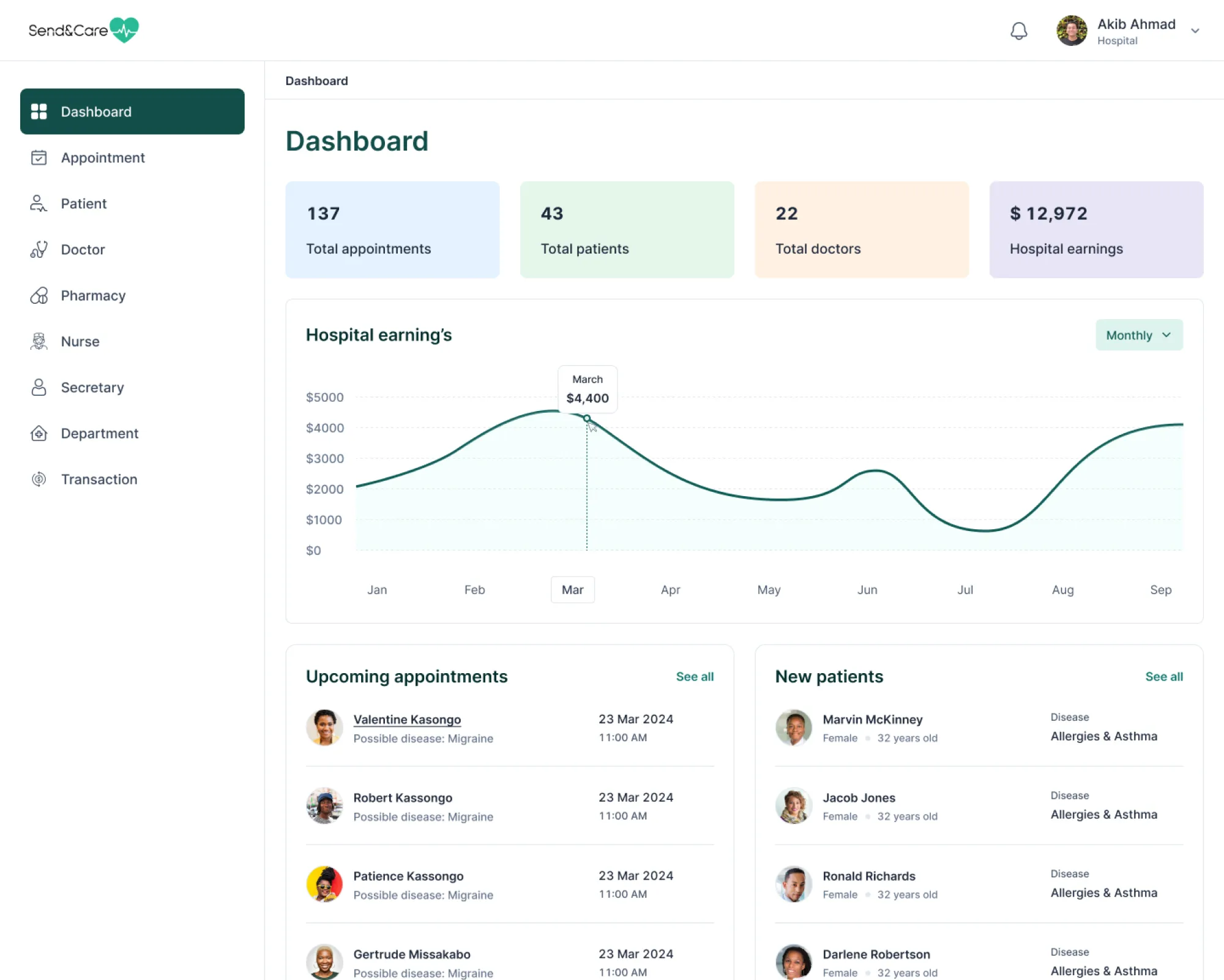
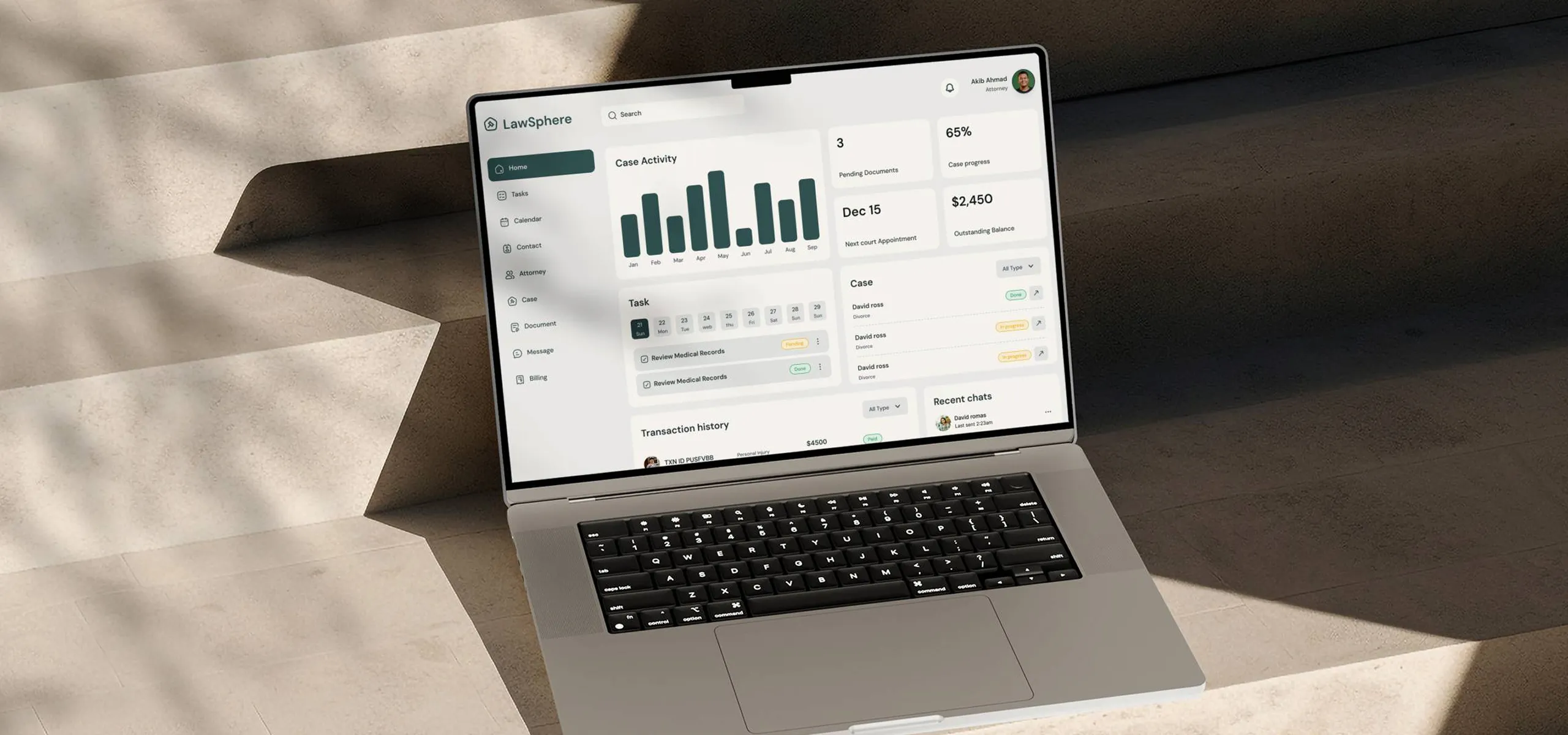
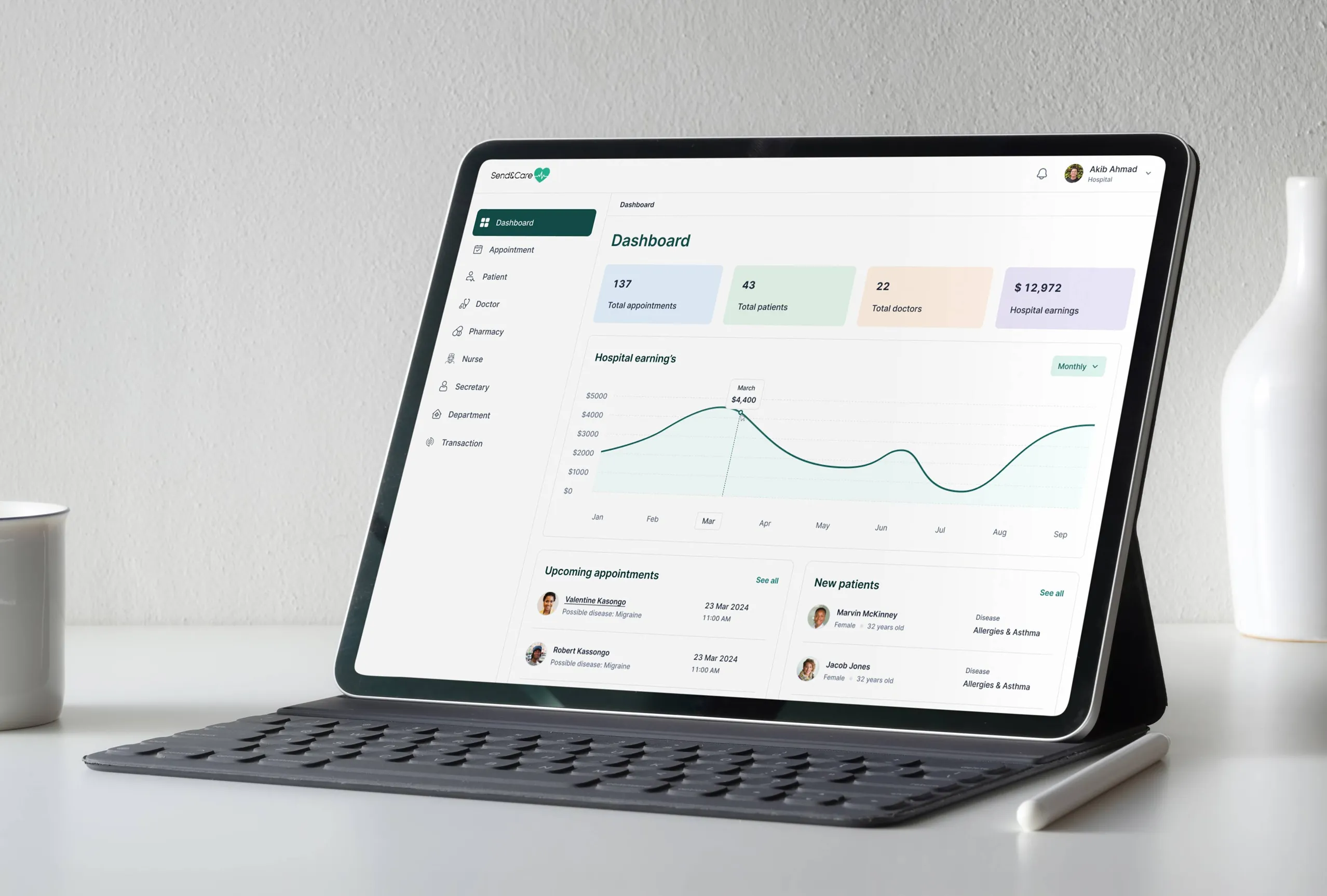
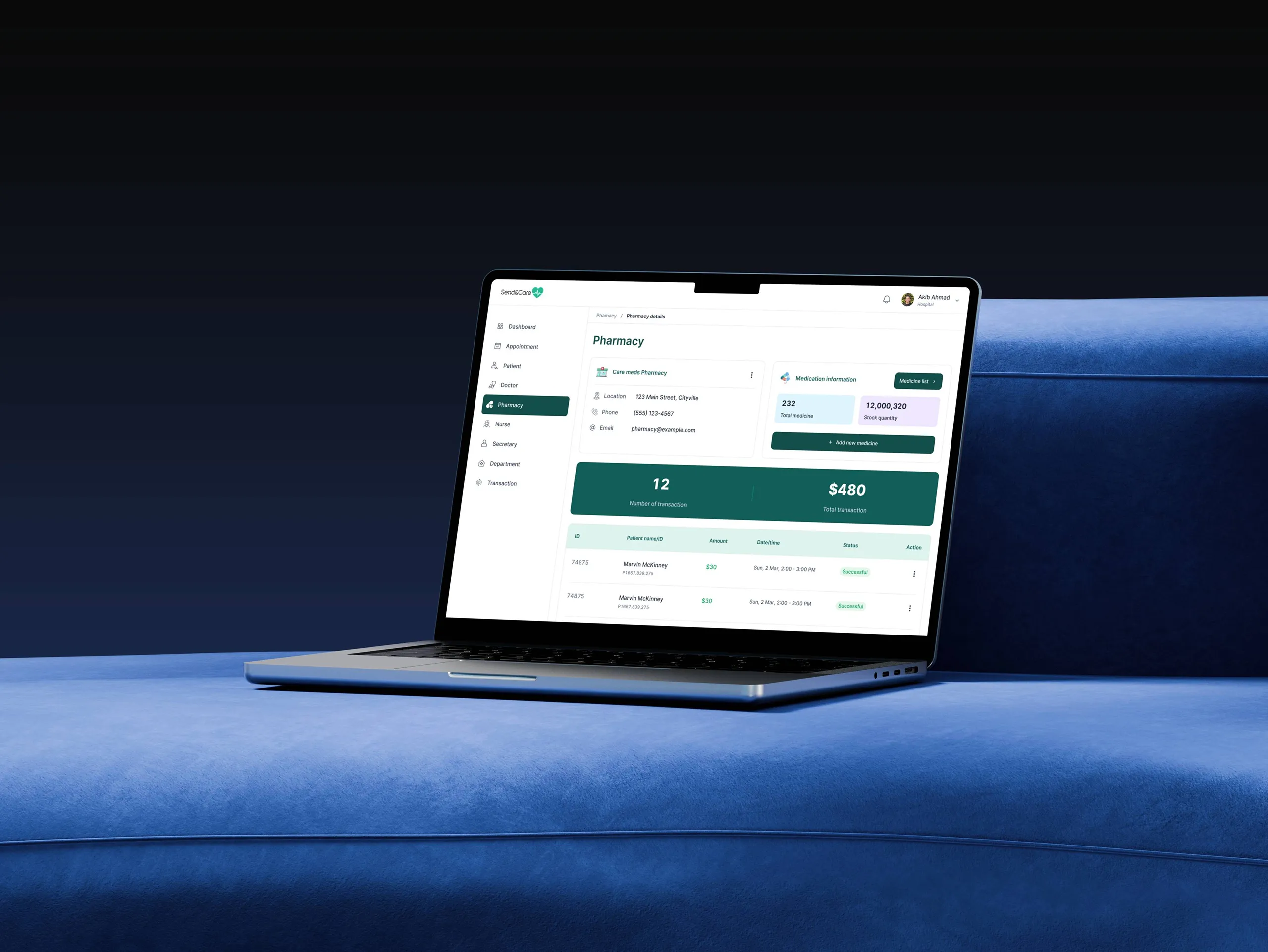
Brings Clarity to Complex Data
Convex helps SaaS companies, product teams, and data driven businesses design dashboards that transform complex information into experiences that feel clear, actionable, and essential to everyday decision making.
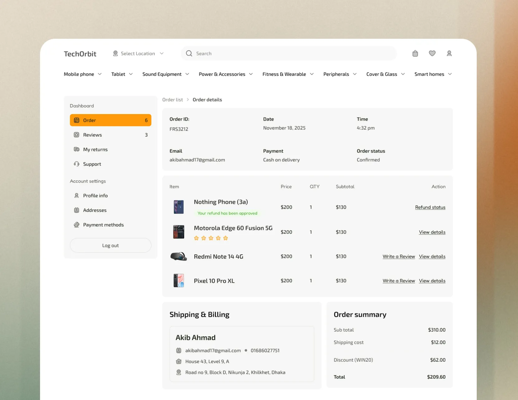
What is dashboard UI UX design?
Start your design
Modern businesses generate enormous amounts of data across analytics tools, CRMs, financial platforms, operational systems, and SaaS products. The challenge is no longer collecting information. It is helping users understand it quickly enough to make confident decisions under real world pressure. Most dashboards fail at this by presenting raw data through cluttered layouts, dense tables, and overly complex charts that show what is happening without helping users understand why it matters or what action to take next.
Great dashboard UI and UX design solves this problem by transforming complex data into experiences that feel clear, intuitive, and immediately actionable. It ensures the right information reaches the right user at the right moment through visual systems that are easy to understand without requiring deep analytical expertise. A well designed dashboard does more than display numbers. It helps users identify patterns, spot anomalies, understand what matters most, and make confident decisions faster.
When dashboard design is done well, your product becomes more than a place to store data. It becomes a decision making tool users rely on daily because it delivers insights they need quickly and clearly. That kind of experience drives higher daily engagement, strengthens retention, and creates the kind of user satisfaction that naturally fuels long term word of mouth growth.
Clarity drives daily active usage
Clear dashboards build daily habits, reduce churn, and increase retention.
Great dashboards reduce support volume and training costs
Clear dashboards reduce support costs and help users find answers faster.
Data visualization quality determines product perception
Great dashboard design builds trust, supports premium pricing, and speeds up sales.
Types of Dashboards We Design
From analytics platforms to operational control centers — we design every type of dashboard your product or business needs to turn data into decisions.
What you get
Every UI and UX project at Convex comes with everything your team needs to build a product that looks great, works smoothly, and keeps users coming back.
Start a project
User Research & Persona Definition
Real insights into how your users think about and interact with data
Data Audit & Information Architecture
Every data point organized by priority, relevance, and decision value
User Flow & Navigation Design
Every dashboard journey mapped to be logical, intuitive, and efficient
Wireframes & Low-Fidelity Layouts
Dashboard structure validated before visual design begins
Data Visualization Design
Charts, graphs, and visual displays that make data instantly understandable
High-Fidelity UI Screens
Pixel-perfect dashboard screens covering every state and interaction
Empty, Loading & Error States
Every non-data state designed clearly so users always know what is happening
Filter, Search & Control Design
Powerful data controls that feel intuitive for every user type
Complete Design System
Reusable dashboard components that keep your product consistent as it grows
Interactive Prototype
A fully clickable dashboard prototype ready to test and validate
Figma Source Files
Fully organized design files your developers can build from directly
Developer Handoff Documentation
Detailed specs so developers build exactly what was designed
Unlimited Revisions Within Scope
Until every screen feels exactly right
Post-Handoff Support
Available throughout your development phase
How We Design Your Dashboard
A structured, data-centered process designed to turn your most important metrics into a beautifully designed, intuitively organized dashboard that your users open every day and could not imagine working without.
Book a call
Step 01
Discovery & Data Audit
Step 02
Information architecture & user flow
Step 03
Wireframes & Data Visualization Planning
Step 04
UI Design & Data Visualization
Step 05
Prototype, Testing & Handoff
Why your dashboard needs great design
Most dashboards are built by engineers who understand data deeply but design poorly. The result is powerful data trapped behind confusing interfaces that nobody actually uses. Here is what great dashboard design does differently — and what it means for your product and your business.
Start a project
Reason 01
Confusing dashboards drive churn in data products
Reason 02
Poor data visualization destroys decision confidence
Reason 03
Dashboard quality determines enterprise sales velocity
Reason 04
Well-designed dashboards reduce training and support costs
This is for you if...
Dashboard design is for any product or business that has data and users who need to understand it. Here is how to know if Convex is the right design partner for your dashboard project.
Start a project
You are building a data product or analytics platform
Design a dashboard that makes your data clear, valuable, and worth subscribing to.
Your existing dashboard is confusing and underused
Low dashboard engagement? Redesign it to make insights clear and actionable.
Your dashboard is hurting your enterprise sales
Redesign your dashboard to impress enterprise buyers and close deals faster.
You have complex data that users find overwhelming
Turn complex data into clear, actionable insights with better dashboard UX.
You are adding a dashboard to an existing product
Add a dashboard users love with clear insights and seamless product integration.
You need an internal dashboard for your own business
Design internal dashboards teams understand instantly and use every day.
Related projects
View all projects
Simple,
Transparent Pricing
Everything your dashboard needs to turn complex data into clear decisions.
Dashboard design
Starting from
$2,500
A complete, data-centered dashboard design — built for clarity, daily usage, and the kind of insight that makes your product indispensable.
Delivered in 4-6 weeks
User Research & Persona Definition
Data Audit & Information Architecture
User Flow & Navigation Design
Wireframes & Low-Fidelity Layouts
Data Visualization Design
High-Fidelity UI Screens
Complete Design System
Unlimited Revisions Within Scope
Developer handoff documentation
Data products & analytics platforms
Dashboards that are confusing or underused
Enterprise products needing better demos
Products with overwhelming complex data
Products adding a dashboard feature
Internal business dashboards
Frequently Asked Questions
Everything you need to know about investing in dashboard UI/UX design — and the real impact it can make on your product engagement, enterprise sales, and user retention.
How will a better dashboard design improve my product's user retention?
Dashboard quality is one of the strongest drivers of retention in data driven products because the dashboard is often the main reason users return every day. A cluttered or confusing experience increases cognitive effort and gradually pushes users away from the product over time. A well designed dashboard does the opposite by helping users find answers quickly, understand what matters immediately, and feel confident using the product regularly. Improvements in dashboard clarity and usability often translate directly into stronger monthly and annual retention rates.
How will a better dashboard help us close more enterprise deals?
The dashboard is often the centerpiece of an enterprise software demo, and enterprise buyers form many of their initial impressions within the first 30 to 60 seconds of seeing it. A dashboard that presents data clearly, feels professionally designed, and communicates analytical sophistication immediately builds credibility and confidence in the product. It helps accelerate sales conversations, strengthen perceived value, and differentiate your product from competitors with similar features but weaker user experiences. Enterprise buyers are not only evaluating functionality. They are evaluating whether the product will help their teams work smarter and make better decisions.
How does dashboard design directly impact our revenue?
Dashboard design influences revenue across three important areas at the same time. First, it improves retention because users who consistently receive clear value from a dashboard are far less likely to cancel their subscription. Second, it strengthens enterprise sales by helping the product appear more professional, credible, and analytically capable during demos and evaluations. Third, it supports expansion revenue because users who understand and trust the product are more likely to upgrade plans, add team members, and increase usage over time. Great dashboard design is not just a visual improvement. It directly shapes business performance.
How do you make complex data easy to understand in a dashboard?
Making complex data feel clear is the core purpose of great dashboard design. It requires thoughtful information architecture, effective data visualization, and strong visual hierarchy working together as one system. We begin by prioritizing information based on decision making importance so the metrics that matter most are immediately visible instead of buried inside cluttered layouts. We choose visualization styles that match the story the data is trying to communicate, using line charts for trends, bar charts for comparisons, and proportional charts for distribution insights. Color is used intentionally to communicate meaning and guide attention rather than simply decorate the interface. We also design with progressive disclosure, giving users a high level overview first while allowing deeper exploration only when needed, so the experience remains clear for both quick decision makers and advanced analysts.
Can you redesign an existing dashboard that users find confusing?
Yes, and dashboard redesigns are often some of the highest impact projects because improvements in user engagement can become visible almost immediately in product analytics. Before redesigning, we conduct a detailed review of your existing dashboard experience, including engagement patterns, frequently used metrics, recurring user frustrations, support ticket trends, and the interface issues most likely affecting clarity and usability. We then build a redesign strategy specifically focused on solving those problems. The result is not just a more modern dashboard, but a clearer and more valuable experience that helps users get the insights they came for faster and more confidently.
Do you sign NDAs?
Absolutely. We understand that dashboard projects often involve proprietary data models, sensitive business metrics, and unreleased product functionality that need to remain protected. We are happy to sign a Non Disclosure Agreement before the first consultation call so you can discuss your product openly and confidently from the very beginning.